Color Use Guidelines for Mapping
and Visualization
Cindy Brewer
The graphic display of data plays a critical role in visualization
and exploratory data analysis. Appropriate use of color for data display
allows interrelationships and patterns within data to be easily observed.
The careless use of color will obscure these patterns. When color is used
`appropriately,' the organization of the perceptual dimensions of color
corresponds to the logical ordering in the data. The color scheme typology
I present matches a comprehensive listing of the ways in which data are
organized with corresponding organizations of hue and lightness.
The scheme guidelines are limited to the use of color to directly
represent data that occur at locations in the graphic where colors occur.
The types of thematic maps to which these guidelines apply are choropleth
maps (for example, census tracts filled with colors representing the percentage
of the population from an ethnic group), filled isoline maps (for example,
color bands that mark set ranges of terrain elevation), and qualitative
areal-extent maps (for example, different colors for different types of
vegetation). My hope is that these guidelines and the associated terminology
will also guide the work of people grappling with data visualization challenges
in diverse disciplines such as physics, medicine, psychology, and graphic
arts.
A disorderly jumble of colors produces a map that is little more
than a spatially arranged look-up table. The goal of this WWW resource
is to help you do better than that by using color with skill. This resource
provides a generalized set of color schemes and example maps.
Color Scheme Types and Combinations: Overview
Select the color scheme of interest below to see examples of it in use.
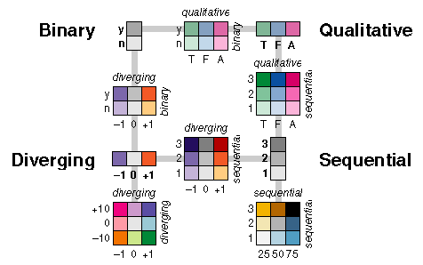
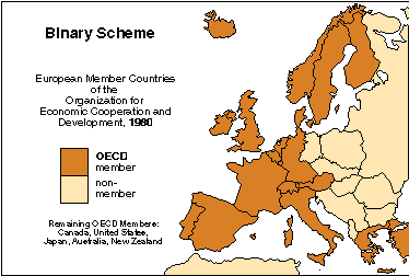
Binary Color Schemes
Binary schemes show nominal differences that are divided into only two
categories. The primary perceptual difference between the two categories
of a binary scheme may be a lightness step, unlike the use of hue for multi-valued
qualitative variables. Incorporated versus unincorporated urban areas are
well represented by a binary color scheme.
Binary Color Scheme Example
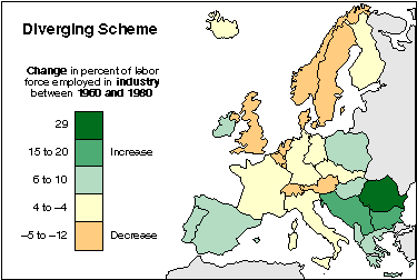
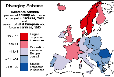
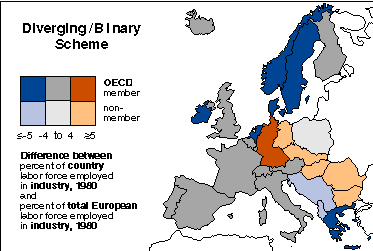
Diverging Color Schemes
Diverging schemes allow the emphasis of a quantitative data display to
be progressions outward from a critical midpoint of the data range. A typical
diverging scheme pairs sequential schemes based on two different hues so
that they diverge from a shared light color, for the critical midpoint,
toward dark colors of different hues at each extreme. Deviations above
and below the median death rate from a disease, for example, are well represented
by a diverging color scheme.
Diverging Color Examples
Diverging Color Schemes: Munsell Charts
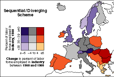
Diverging Binary and Diverging Sequential Color Schemes
Diverging/binary and diverging/sequential schemes have the same perceptual
characteristics. The success of the schemes hinge on the large contrast
range available in the lightness dimension. Large lightness steps are used
for the binary or sequential variable. Smaller lightness steps, that are
bolstered by a change in hue, represent the diverging component of the
scheme within each large lightness step of the comparison variable. For
example, data on cancer rates above and below a mean rate (diverging) and
air pollution levels (sequential) are well represented by a diverging/sequential
color scheme.
Diverging Binary Color Example
Diverging Sequential Color Example
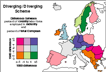
Diverging Diverging Color Schemes
Diverging/diverging schemes are the only two-variable schemes that depart
from the idea of a direct overlay of the component one-variable schemes.
Place a different moderately-dark hue at each of the four corners of the
legend. These four hues represent categories that are extremes for both
variables. Place a very light or white color at the center of the legend,
creating an appropriately light color for the class that contains the critical
value or midpoint of both variables. The remaining colors are lighter than
the corners, because they contain the midpoint of one of the two variables,
and they are transitional hues that lie between their adjacent hues. The
color circle is essentially stretched around the perimeter of the legend
and lightness adjusted in response to critical values within the data ranges
of both variables. Areas above and below the poverty line in 1960 and 1990,
for example, are well represented by a diverging/diverging color scheme.
Diverging Diverging Color Example
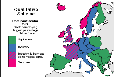
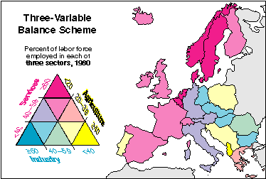
Qualitative Color Schemes
Qualitative schemes use differences in hue to represent nominal differences,
or differences in kind. The lightness of the hues used for qualitative
categories should be similar but not equal. Assign the lightest, darkest,
and most saturated hues in the scheme to categories that warrant emphasis
on the map. Data about land use or land cover, for example, are well represented
by a qualitative color scheme.
Qualitative Color Example
Qualitative Color Schemes: Munsell Charts
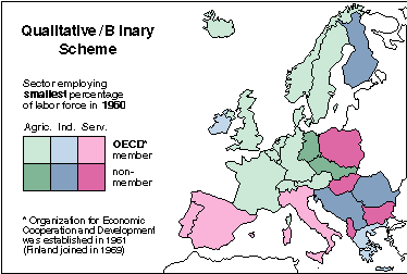
Qualitative Binary Color Schemes
In qualitative/binary schemes, light and dark versions of each hue of the
qualitative variable correspond to the binary variable categories. Binary/binary
schemes are a subset of the qualitative/binary schemes with one binary
difference represented by a hue difference and the other by a lightness
difference. A multi-hued vegetation map (qualitative) with darker hues
for vegetation on public lands and lighter hues for vegetation on private
lands (binary) is well suited by a qualitative/binary color scheme.
Qualitative Binary Color Example
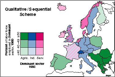
Qualitative Sequential Color Schemes
In qualitative/sequential schemes, the qualitative variable is represented
with hues and the quantitative variable is represented with sequences of
lightness steps within each hue. Binary/sequential schemes are a subset
of qualitative/binary schemes with the binary variable represented by a
hue difference and lightness differences reserved for the sequential variable.
Population percentages (sequential) of varied dominant ethnic groups or
religions (qualitative), for example, are well represented by a qualitative/sequential
color scheme.
Qualitative Sequential Color Example
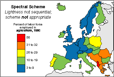
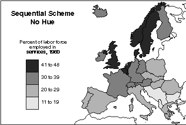
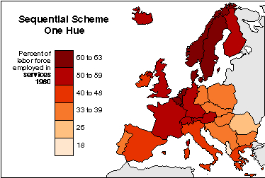
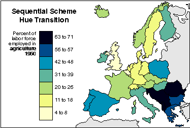
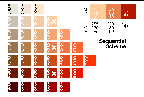
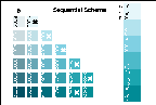
Sequential Color Schemes
Sequential data classes are logically arranged from high to low, and this
stepped sequence of categories should be represented by sequential lightness
steps. Low data values are usually represented by light colors and high
values represented by dark colors. Transitions between hues may be used
in a sequential scheme, but the light-to-dark progression should dominate
the scheme. Terrain slope categories or population densities, for example,
are well represented by sequental color schemes.
Sequential Color Example
Sequential Color Schemes: Munsell Charts
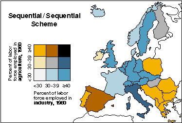
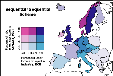
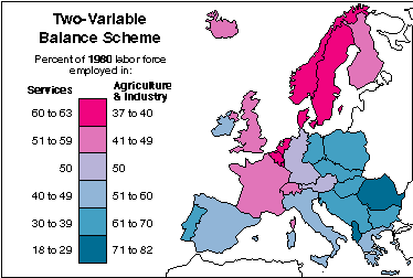
Sequential Sequential Color
Schemes
Sequential/sequential schemes are the logical mix of all combinations of
the colors in two sequential schemes. Thus, the schemes are based on two
hues. The hue mixtures may form a third hue (magenta and cyan sequences
produce a variety of transitional purple-blues). If the two hues crossed
are approximate complements, their mixtures produce a neutral gray diagonal
and desaturated transitional colors. Systematic lightness differences throughout
the scheme are important; do not depend on hue to impart the magnitude
message. Use hue transitions to designate differences in proportions of
the two variables mapped. For example, data on educational attainment crossed
with crime rate categories are well represented by a sequential/sequential
color scheme.
Sequential Sequential Color Examples
[nahoru]
[zpět]
(C) Jakub Langhammer, 26.3.2002


